
Databricks Account Usage & Cost Attribution Dashboard
A custom Databricks Lakeview dashboard that converts raw DBU consumption into real dollars and splits spend by workspace, user, project, cluster, and feature (Vector Search, Model Serving, Serverless) - so management can see exactly who and what is driving the bill.
Repository link coming soon
Problem Statement
Databricks' native account billing dashboard is good at telling you how many DBUs you burned, but not much good at answering the questions management actually asks:
- "How many dollars did we spend?" - The default views lean heavily on DBU (Databricks Units), an abstract consumption unit. DBUs are not dollars, and the DBU-to-dollar rate differs by SKU, product, and commit tier, so a DBU total tells finance almost nothing.
- "Which workspace spent it?" - Usage is reported against a
workspace_id(a long numeric ID). Nobody in a management review knows that1000000000000003is the dev-sandbox workspace. There is no built-in place to give a workspace a human name. - "Which feature is expensive?" - Vector Search, Model Serving, Serverless SQL, and all-purpose compute all land in the same usage stream. The default dashboard does not cleanly break spend down per feature per workspace.
- "Which user or notebook caused the spike?" - When cost jumps, leadership wants a name and a project, not a SKU code.
So I built my own dashboard on top of the Databricks system tables that answers all four questions in dollars, and lets you drill from account total → workspace → feature → user → project → cluster.
What the dashboard looks like
The summary page opens with the numbers management asks for first - total spend in dollars, total DBU, and how that spend splits across features and workspaces - followed by a ranked list of the biggest individual spenders:
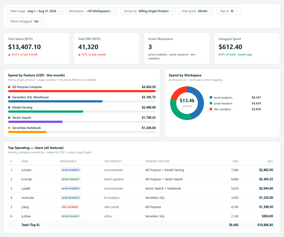
(All names, workspaces, endpoints, clusters, and figures shown in these screenshots are demo data - this dashboard sits over a real company Databricks account, so no real identifiers or amounts are shown.)
The Core Idea
Three things had to come together to turn raw usage into a management-ready cost view:
- A workspace mapping - a table that maps every
workspace_idto a readableworkspace_name(e.g. prod-analytics, prod-research, dev-sandbox). - A dollar conversion - joining usage against the live price list so every row of consumption is priced in USD instead of DBU.
- An attribution layer - joining in cluster metadata and custom tags so each dollar can be traced back to a user, a project, and a cluster.
Turning DBU into Dollars
The heart of the whole thing is the pricing join. system.billing.usage gives a
usage_quantity per SKU per day; system.billing.list_prices gives the USD unit price for that
SKU - but prices have validity windows (price_start_time / price_end_time), so the join has to
match not only the SKU but the point in time the usage occurred:
-- price every usage row in USD instead of DBU
prices as (
  select coalesce(price_end_time, date_add(current_date, 1)) as coalesced_price_end_time, *
  from   system.billing.list_prices
  where  currency_code = 'USD'
),
list_priced_usd as (
  select
    coalesce(u.usage_quantity * p.pricing.effective_list.default, 0) as usage_usd,
    date_trunc('MONTH', u.usage_date) as usage_month,
    u.*
  from usage_filtered u
  left join prices p
    on  u.sku_name  = p.sku_name
    and u.usage_unit = p.usage_unit
    and (u.usage_end_time between p.price_start_time and p.coalesced_price_end_time)
)
Two details make this robust:
coalesce(price_end_time, ...)- the current, still-active price has aNULLend time. Coalescing it to tomorrow means today's usage still matches the current price instead of falling through the join.pricing.effective_list.default- the price list is a nested struct; pulling the effective list rate is what makes the number match what actually shows up on the invoice.
Naming the Workspaces
Out of the box, usage is grouped by an opaque numeric workspace_id. I gave each one a real name
so the dashboard reads like a business report instead of a system log. I did this two ways
depending on the widget - a lightweight inline map for parameterised queries, and a proper
workspace_details table for the attribution queries:
-- lightweight inline mapping used by the parameterised overview queries
workspace as (
  select explode(map_entries(from_json(
    '{"1000000000000003":"dev-sandbox","1000000000000001":"prod-analytics","1000000000000002":"prod-research"}',
    'map<string,string>'
  ))) as kvp,
  kvp['key']   as workspace_id,
  kvp['value'] as workspace_name
)

-- ... joined so an unmapped id still shows up gracefully
case
  when workspace_name is null then concat('id: ', u.workspace_id)
  else concat(workspace_name, ' (id: ', u.workspace_id, ')')
end as workspace
The main.default.workspace_details table does the same job for the deeper attribution queries,
so adding a new workspace is a one-row insert, not a dashboard rewrite.
Attributing Spend to a User, Project and Cluster
The question leadership really cares about is "who caused this?". To answer it I join usage
against system.compute.clusters for the cluster name and read custom_tags.Project for the
project, then price it in dollars - all filtered to the current month and to all-purpose compute:
SELECT date_format(usage_date, 'MMMM') AS Month,
       m.workspace_name,
       custom_tags.Project,
       c.cluster_name,
       round(sum(u.usage_quantity), 2) AS Total_DBU,
       round(sum(u.usage_quantity * l.pricing.effective_list.default), 2) AS Total_USD
FROM   system.billing.usage u
LEFT JOIN main.default.workspace_details m
       ON u.workspace_id = m.workspace_id
JOIN   system.billing.list_prices l
       ON l.sku_name = u.sku_name
      AND u.usage_date >= l.price_start_time
      AND u.usage_date <= coalesce(l.price_end_time, date_add(current_date(), 1))
LEFT JOIN (
       -- latest known name for each cluster
       SELECT cc.cluster_name, cc.cluster_id, cc.change_time
       FROM system.compute.clusters cc
       JOIN (SELECT cluster_id, max(change_time) change_time
             FROM system.compute.clusters GROUP BY cluster_id) a
         ON cc.cluster_id = a.cluster_id AND cc.change_time = a.change_time
     ) c
       ON c.cluster_id = u.usage_metadata.cluster_id
WHERE  u.usage_date >= date_trunc('month', current_date())
  AND  u.usage_unit = 'DBU'
  AND  u.billing_origin_product IN ('ALL_PURPOSE')
GROUP BY date_format(usage_date, 'MMMM'), m.workspace_name, custom_tags.Project, c.cluster_name
ORDER BY Total_USD DESC;
The inner sub-query on system.compute.clusters is there because a cluster can be edited over
time and therefore has multiple metadata rows - I keep only the latest change_time per
cluster_id so each cluster resolves to one current name.
How the Data Model Fits Together
Drill-Down the Dashboard Supports
The dashboard is built so management can start at the account total and keep asking "where is that coming from?" - each level is a filter or a group-by away:
This is the path that answers the real questions: Vector Search is up this month → it's the prod-analytics workspace → user X → the "recommender" project → this specific cluster.
Feature-Level Cost Breakdown
Because everything is priced in USD and grouped by billing_origin_product / SKU, each managed
feature gets its own line the business can reason about:
| Feature | Where the cost comes from | Why management watches it |
|---|---|---|
| Vector Search | Serving endpoints backing embeddings/RAG | Easy to leave running; scales with index size and QPS |
| Model Serving | Real-time model endpoints | Billed while endpoints are up, not just per-request |
| Serverless SQL | Serverless SQL warehouses | Convenient, but spins up per query team |
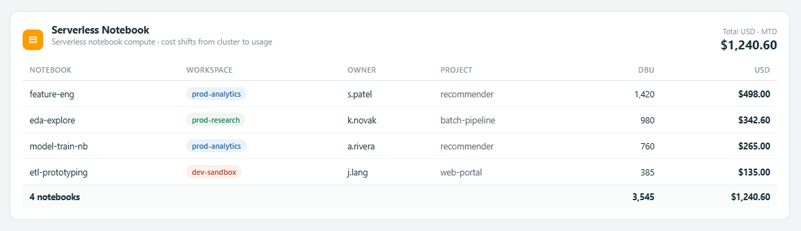
| Serverless Notebook | Serverless notebook compute | Removes cluster management, shifts cost to usage |
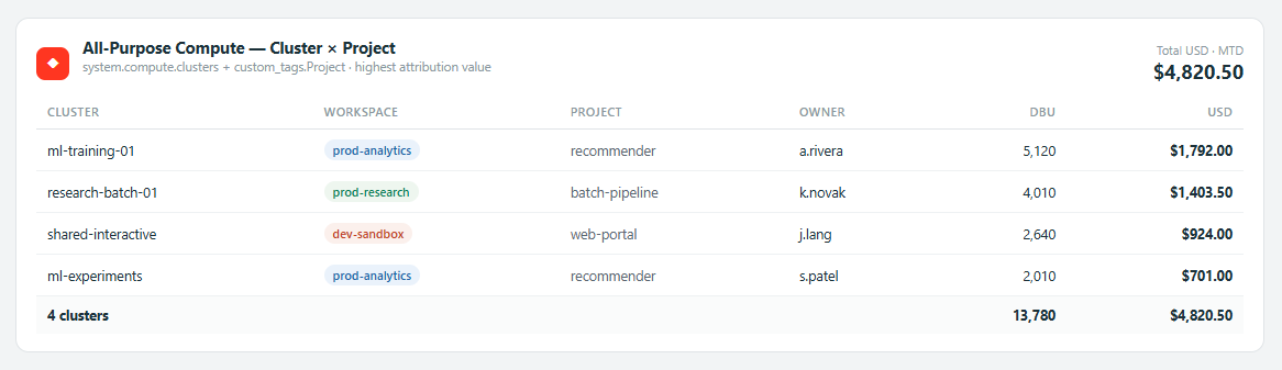
| All-Purpose Compute | Interactive clusters | Highest attribution value - maps to user/project/cluster |
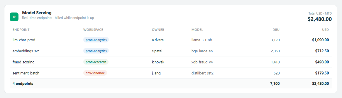
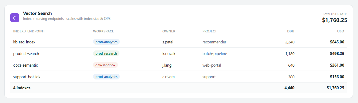
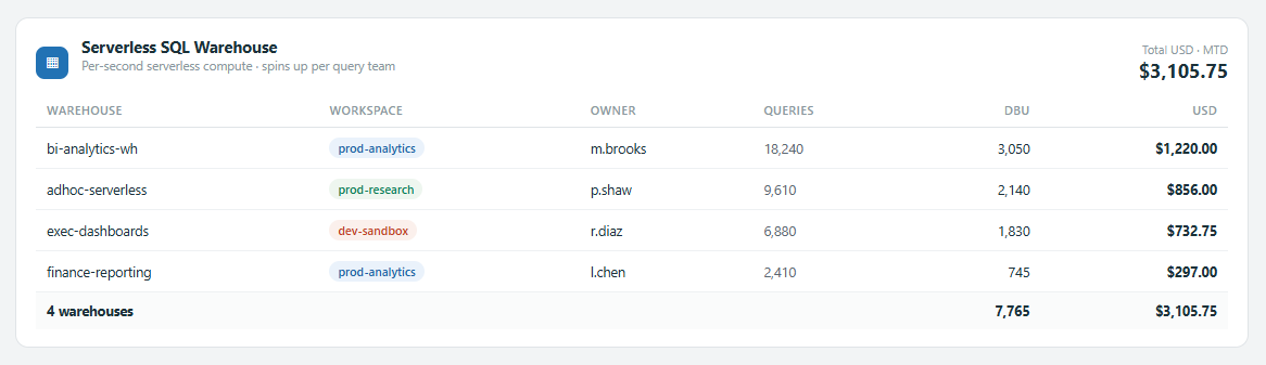
Each feature also gets its own priced-out breakdown, so a manager can open a single section and see exactly which endpoint, warehouse, notebook, or cluster - and which user - is driving that feature's spend this month.
Model Serving - real-time endpoints, priced per endpoint with the model behind each one:
Vector Search - index/serving endpoints, attributed to the owner and project driving them:
Serverless SQL Warehouse - per-warehouse serverless spend with query volume alongside cost:
Serverless Notebook - serverless notebook compute broken down by notebook, owner and project:
All-Purpose Compute - the highest-value view: each interactive cluster joined to its project tag and owner, exactly as the attribution query produces it:
Interactivity - Parameters and Filters
The dashboard is parameter-driven rather than a fixed report, so a reviewer can slice it live in a meeting:
- Date range -
param_start_date/param_end_datedate pickers. - Workspace - single-select including an
<ALL WORKSPACES>option. - Grouping key - group by Workspace, Billing Origin Product, or SKU.
- Time grain - roll usage up by Day, Week, or Month.
- Top-N spenders - show the biggest cost drivers, with a toggle for including/excluding nulls.
- Tag matching - highlight usage where expected cost tags are missing, so untagged (and therefore un-attributable) spend is visible instead of hidden.
Why It Matters
- Finance-ready - every number is in dollars and reconciles to the invoice, not in DBUs nobody can budget against.
- Accountability - spend is attributable to a workspace, a user, a project, and a cluster, so a cost spike has an owner instead of being "the Databricks bill went up".
- Governance - the tag-mismatch view surfaces untagged usage, which is exactly the spend that usually escapes chargeback.
- Self-service for management - leadership can answer their own "who/what/why" questions from the filters without waiting on an engineer to run a query.
Technologies Used
- Databricks Lakeview dashboards (
.lvdash.json) for the interactive, parameter-driven UI. - Spark SQL over Unity Catalog system tables -
system.billing.usage,system.billing.list_prices, andsystem.compute.clusters. - A custom
workspace_detailsmapping table plus custom cost tags for user/project attribution. - FinOps cost-attribution modelling - pricing windows, chargeback dimensions, and untagged- spend detection.